So I have been trying to beef up a website and was just not able to find an easy solution to manage Wordpress galleries. Many have recommended that I use the powerhouse NextGEN plugin (with over 8 million downloads) but given the high importance of managing photos on a website, I wanted a solution that was not tied to any specific 3rd party plugin. Not only for future proofing but also wanting a solution that was easy to use and maintain in the long run, I am trying to use as much default Wordpress functionality as possible. This is especially important given the latest Wordpress 3.7 now has auto updates built in.
It has been show many times over that plugins, however popular they may be, can always run the risk of being dropped by the original developer(s) or being purchased and turned into something else. The biggest risk of using a 3rd party plugin is the risk of it breaking the latest Wordpress update or have it conflict with other plugins. Either you are starting a new Wordprss site or you are reading this article about managing Wordpress galleries probably because your current way to manage Wordpress Galleries is not working out.
I could not believe it was so difficult to accomplish these 3 things in Wordpress:
- Display thumbnail at a specific size on the album post / page
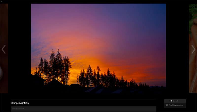
- Showcase images in a lightbox when users clicked on a thumbnail
- Display images in a responsive environment across platforms and devices
Because of these requirements, I almost gave in and turned to a 3rd party plugin (or a combination of plugins) to manage the Wordpress Gallery. After many plugin installs, testing and deactivations, I finally found a solution that will work. Be warned, it’s not the prettiest or the most flexible, but for any website that is looking for an easy-to-use system to showcase photos, this is what you can do.
The best part of this solution is that it takes advantage of using the default Wordpress Gallery without a 3rd party plugin. Well, you do need a plugin, but that plugin is not a 3rd party one; it’s called Jetpack and released by Wordpress itself. This set up has huge bonus as it is responsive and behaves properly across devices and platforms. Many of the most popular image managing plugins currently do not not display properly across devices.
Best Responsive Wordpress Gallery – Setup
Here is what you do to set up the Wordpress Gallery.
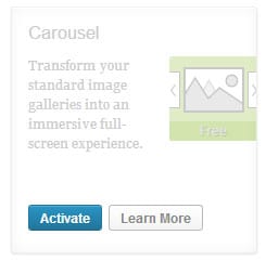
Install the Jetpack plugin
Enable the Carousel Feature within Jetpack. Note: you may need to create a Wordpress.com account in order to activate and authorize Jetpack. Just follow the on-screen instructions.
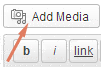
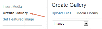
Add Media in a post using the Wordpress Create Gallery function.
You only need to run this step if your default Wordpress is not set up with the correct thumbnail size.
Under Settings >> Media, you will see something like this:
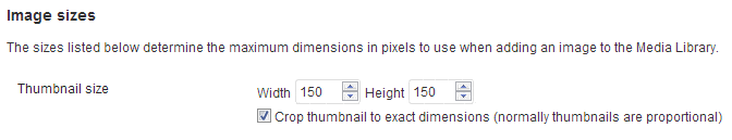
This is the perfect size for what I needed. If this is not the correct size to display your thumbnails, either adjust this setting or do the following.
Again, only follow these instructions if your default thumbnail size is not the correct size that you want. To manually tell Wordpress what image size you want, all you have to do is add a simple piece of code after you insert the actual gallery. You will have to know Wordpress functions.php settings. I have this in my functions.php file:
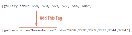
add_image_size( 'home-bottom', 150, 150, TRUE );
So I added the image size variable “home-bottom” in my Wordpress (I use text editor) like so:
Test Your Own Thumbnail Sizes
For my set up, a thumbnail of 150×150 fit perfectly, even across devices. Test your own sizes and see which works best. For those with a slightly less wide website, try also 75×75. That works well too. Remember, if you don’t have this thumbnail size in your functions.php file, simple open the file in the Wordpress editor, locate the “add_image_size” area and add your own size.
Now you can upload your gorgeous images into your Wordpress site and know that it will be displayed properly with the correct-sized thumbnails. Your photos will also be viewed in a beautiful lightbox as well. I hope Jetpack developers add a thumbnail sizing feature in future releases so all of the above will be automatic.
For a demo, go to this Wordpress responsive album here. For me, this is the best responsive Wordpress Gallery set up, hands down.
Note: After you change the thumbnail display size, remember to regenerate your thumbnails so the new size is displayed. Install the Regenerate Thumbnails to quickly regenerate all thumbnails on your site.